Old Money Style Font Pairings:
The “old money” aesthetic is all about quiet luxury, timeless sophistication, and understated elegance. In design, this look can be achieved not only through muted color palettes and classic layouts but also through thoughtful font pairings. Mixing traditional serifs with clean sans serifs creates a balance of heritage and modernity—perfect for branding, websites, or print materials that aim to evoke sophistication without feeling outdated.
Here are four curated font pairings that capture the essence of old money style:

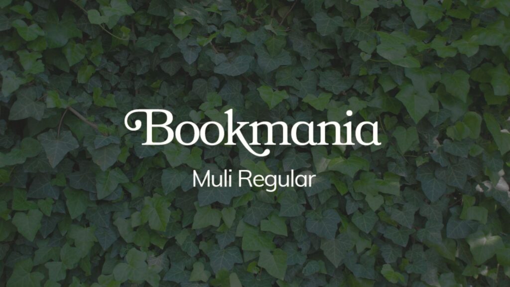
1. Bookmania & Muli Regular

Bookmania is a refined serif inspired by classic book typography, exuding tradition and authority. When paired with Muli Regular, a minimalist sans serif, the result is a clean and elegant pairing. The serif adds a sense of history, while the sans serif provides modern readability.
Best Uses: Editorial layouts, lifestyle blogs, branding for fashion or interior design.
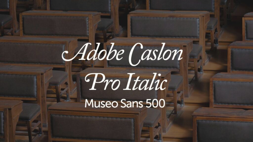
2. Adobe Caslon Pro Italic & Museo Sans 500

Adobe Caslon Pro Italic is a historic, graceful serif often associated with literature and academia. Museo Sans 500 balances it with a modern, structured sans serif presence. This pairing is ideal for projects that need to feel authoritative yet approachable.
Best Uses: Luxury brand websites, cultural magazines, personal branding.
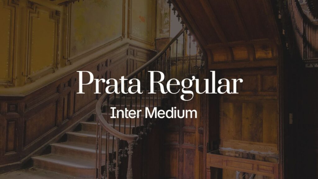
3. Prata Regular & Inter Medium

Prata Regular has a high-contrast serif design with elegant curves, reminiscent of vintage fashion magazines. Inter Medium, a versatile and neutral sans serif, keeps the look grounded and contemporary. This duo is great for brands that want to balance sophistication with digital-friendliness.
Best Uses: High-end eCommerce, wedding stationery, boutique branding.
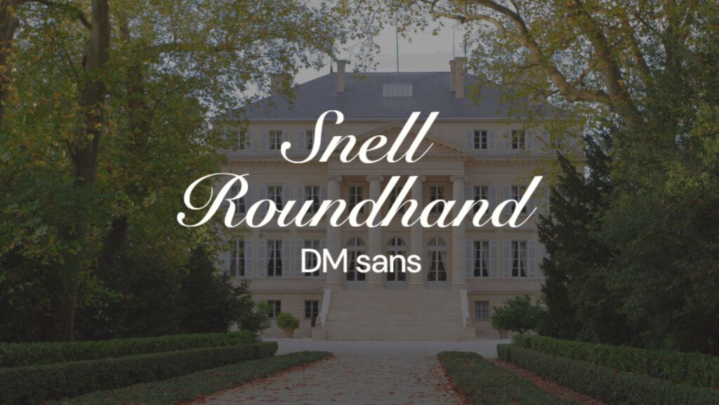
4. Snell Roundhand & DM Sans

For a touch of classic script elegance, Snell Roundhand adds a handwritten, aristocratic flair. Pairing it with DM Sans—a clean, modern sans serif—tones down the formality, ensuring the design feels refined but not overdone. This contrast reflects both heritage and minimalism.
Best Uses: Invitations, luxury product packaging, personal monograms.
Font pairings play a crucial role in conveying personality and style. By mixing serifs and sans serifs, you can capture the timeless essence of old money aesthetics while ensuring readability and modern relevance. Whether you’re designing a website, creating print materials, or developing a brand identity, these pairings will help you achieve understated luxury that never goes out of style.